Homework 8
Isabelle Smith
2025-03-19
Libraries
library(ggplot2) # for graphics
library(MASS) # for maximum likelihood estimation
Work
1. Run the sample code.
Set up a new .Rmd file for this exercise. Copy
and paste the code below into different code chunks, and then read the
text and run the code chunks one at a time to see what they do. You
probably won’t understand everything in the code, but this is a good
start for seeing some realistic uses of ggplot. We will
cover most of these details in the next few weeks.
See original.
2. Try it with your own data.
Once the code is in and runs, try running this analysis on your own data (or data from your lab, or data from a published paper; if you’re stumped, check out publicly available data sets on Dryad, ESA, or the LTER Network).
Read in data vector
Using weight from chickwts data.
Chicken Weights by Feed Type: An experiment was conducted to measure and compare the effectiveness of various feed supplements on the growth rate of chickens.
df <- data.frame(x = chickwts$weight)

summary(df$x)
## Min. 1st Qu. Median Mean 3rd Qu. Max.
## 108.0 204.5 258.0 261.3 323.5 423.0
Plot original data
Plot histogram of data
Plot a histogram of the data, using a modification of the code from
lecture. Here we are switching from qplot to
ggplot for more graphics options. We are also rescaling the
y axis of the histogram from counts to density, so that the area under
the histogram equals 1.0.
p1 <- ggplot(data=df, aes(x=x, y=after_stat(density))) +
  geom_histogram(color="grey60",fill="cornsilk",size=0.2, binwidth = 10)
print(p1)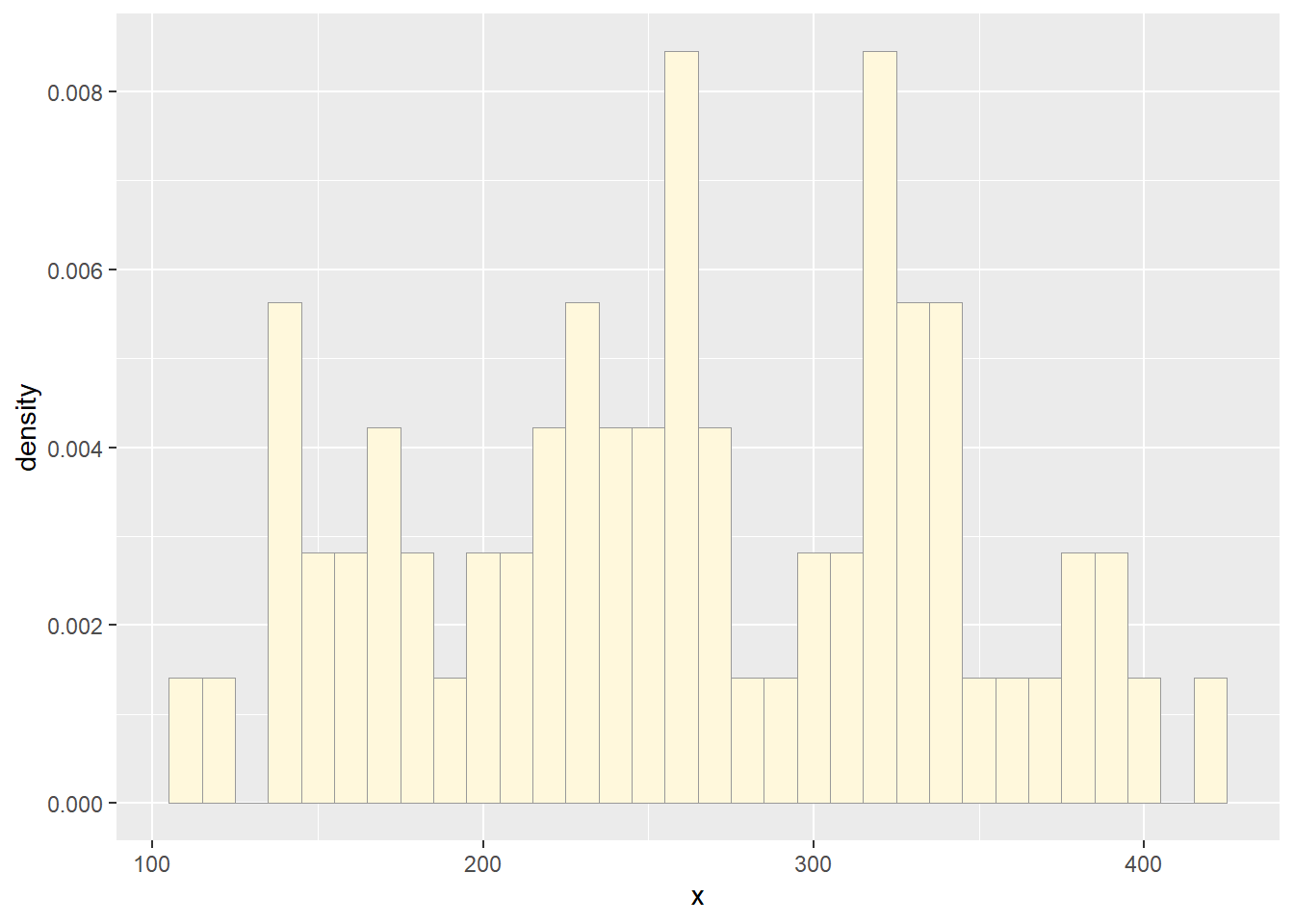
Add empirical density curve
Now modify the code to add in a kernel density plot of the data. This is an empirical curve that is fitted to the data. It does not assume any particular probability distribution, but it smooths out the shape of the histogram:
p2 <-  p1 +  geom_density(linetype="dotted",size=0.75)
print(p2)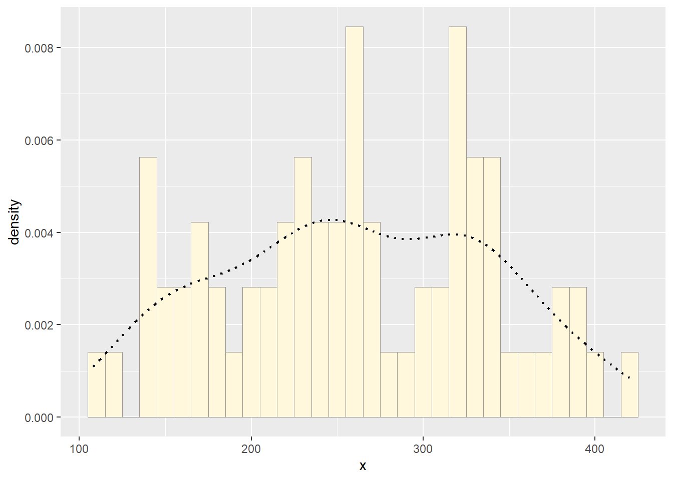
MLE & PDF
Plot normal probability density
Next, fit a normal distribution to your data and grab the maximum likelihood estimators of the two parameters of the normal, the mean and the variance:
normPars <- fitdistr(df$x,"normal")
print(normPars)
## mean sd
## 261.309859 77.521935
## ( 9.200161) ( 6.505496)str(normPars)## List of 5
## $ estimate: Named num [1:2] 261.3 77.5
## ..- attr(*, "names")= chr [1:2] "mean" "sd"
## $ sd : Named num [1:2] 9.2 6.51
## ..- attr(*, "names")= chr [1:2] "mean" "sd"
## $ vcov : num [1:2, 1:2] 84.6 0 0 42.3
## ..- attr(*, "dimnames")=List of 2
## .. ..$ : chr [1:2] "mean" "sd"
## .. ..$ : chr [1:2] "mean" "sd"
## $ n : int 71
## $ loglik : num -410
## - attr(*, "class")= chr "fitdistr"normPars$estimate["mean"] # note structure of getting a named attribute## mean
## 261.3099Now let’s call the dnorm function inside ggplot’s
stat_function to generate the probability density for the
normal distribution. Read about stat_function in the help
system to see how you can use this to add a smooth function to any
ggplot. Note that we first get the maximum likelihood parameters for a
normal distribution fitted to thse data by calling
fitdistr. Then we pass those parameters
(meanML and sdML to
stat_function):
meanML <- normPars$estimate["mean"]
sdML <- normPars$estimate["sd"]

xval <- seq(min(df$x),max(df$x),len=length(df$x))

stat1 <- stat_function(aes(x = xval, y = ..y..), fun = dnorm, colour="red", n = length(df$x), args = list(mean = meanML, sd = sdML))
p2 + stat1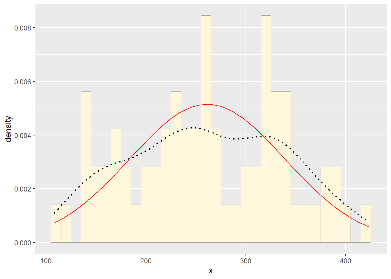
Notice that the best-fitting normal distribution (red curve) for these data actually has a biased mean. That is because the data set has no negative values, so the normal distribution (which is symmetric) is not working well.
Plot exponential probability density
Now let’s use the same template and add in the curve for the exponential:
expoPars <- fitdistr(df$x,"exponential")
rateML <- expoPars$estimate["rate"]

stat2 <- stat_function(aes(x = xval, y = ..y..), fun = dexp, colour="blue", n = length(df$x), args = list(rate=rateML))
p2 + stat1 + stat2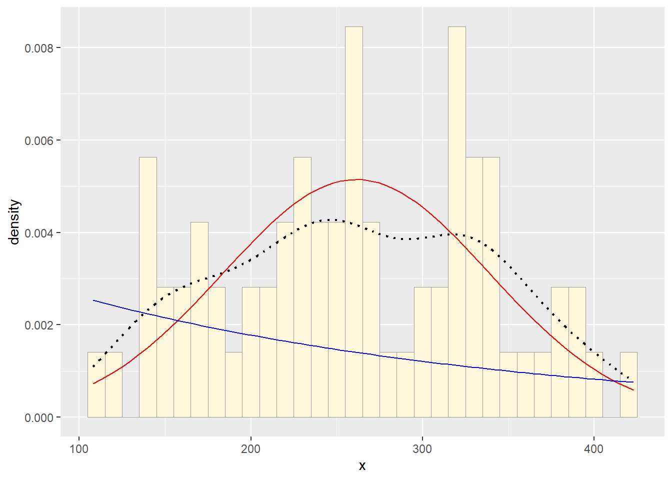
Plot uniform probability density
For the uniform, we don’t need to use fitdistr because
the maximum likelihood estimators of the two parameters are just the
minimum and the maximum of the data:
stat3 <- stat_function(aes(x = xval, y = ..y..), fun = dunif, colour="darkgreen", n = length(df$x), args = list(min=min(df$x), max=max(df$x)))
p2 + stat1 + stat2 + stat3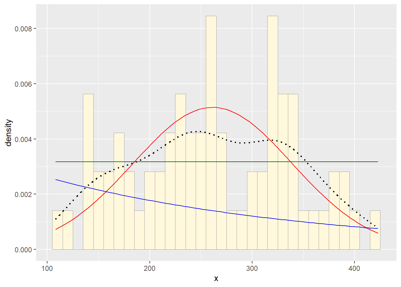
Plot gamma probability density
gammaPars <- fitdistr(df$x,"gamma")## Warning in densfun(x, parm[1], parm[2], ...): NaNs producedshapeML <- gammaPars$estimate["shape"]
rateML <- gammaPars$estimate["rate"]
stat4 <- stat_function(aes(x = xval, y = ..y..), fun = dgamma, colour="brown", n = length(df$x), args = list(shape=shapeML, rate=rateML))
p2 + stat1 + stat2 + stat3 + stat4
Plot beta probability density
This one has to be shown in its own plot because the raw data must be rescaled so they are between 0 and 1, and then they can be compared to the beta.
pSpecial <- ggplot(data=df, aes(x=x/(max(x + 0.1)), y=..density..)) +
  geom_histogram(color="grey60",fill="cornsilk",size=0.2) +
  xlim(c(0,1)) +
  geom_density(size=0.75,linetype="dotted")

betaPars <- fitdistr(x=df$x/max(df$x + 0.1),start=list(shape1=1,shape2=2),"beta")
## Warning in densfun(x, parm[1], parm[2], ...): NaNs produced
## Warning in densfun(x, parm[1], parm[2], ...): NaNs produced
## Warning in densfun(x, parm[1], parm[2], ...): NaNs producedshape1ML <- betaPars$estimate["shape1"]
shape2ML <- betaPars$estimate["shape2"]
statSpecial <- stat_function(aes(x = xval, y = ..y..), fun = dbeta, colour="orchid", n = length(df$x), args = list(shape1=shape1ML,shape2=shape2ML))
pSpecial + statSpecial## `stat_bin()` using `bins = 30`. Pick better value
## with `binwidth`.## Warning: Removed 2 rows containing missing values or values
## outside the scale range (`geom_bar()`).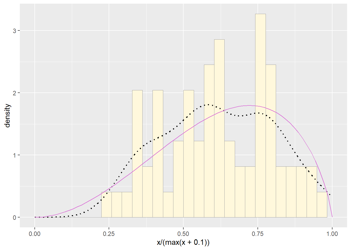
3. Find best-fitting distribution.
Take a look at the second-to-last graph which shows the
histogram of your data and 4 probability density curves (normal,
uniform, exponential, gamma) that are fit to the data. Find the
best-fitting distribution for your data. For most data sets, the gamma
will probably fit best, but if you data set is small, it may be very
hard to see much of a difference between the curves. The
beta distribution in the final graph is somewhat special.
It often fits the data pretty well, but that is because we have assumed
the largest data point is the true upper bound, and everything is scaled
to that. The fit of the uniform distribution also fixes the upper bound.
The other curves (normal, exponential, and gamma) are more realistic
because they do not have an upper bound.
I think the normal distribution fits the data best, but the gamma is a close second.
p2 + stat1 + stat2 + stat3 + stat4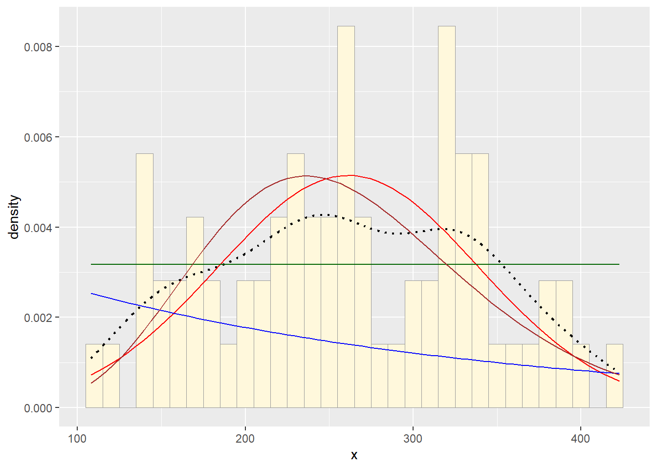
4. Simulate a new data set.
Using the best-fitting distribution, go back to the code and get the maximum likelihood parameters. Use those to simulate a new data set, with the same length as your original vector, and plot that in a histogram and add the probability density curve. Right below that, generate a fresh histogram plot of the original data, and also include the probability density curve.
How do the two histogram profiles compare? Do you think the model is doing a good job of simulating realistic data that match your original measurements? Why or why not?
If you have entered a large data frame with many columns, try running all of the code on a different variable to see how the simulation performs.
Once we get a little bit more R coding under our belts, we will return to the problem of simulating data and use some of this code again.
set.seed(0)

new_df <- data.frame(new_x = rnorm(n=length(df$x), mean=meanML, sd=sdML))

new_range <- range(new_df$new_x)[2] - range(new_df$new_x)[1]

new_p <- ggplot(data=new_df, aes(x=new_x, y=after_stat(density))) +
  geom_histogram(color="grey60",fill="goldenrod1",size=0.2, binwidth=10) +
  geom_density(linetype="dotted",size=0.75) +
  scale_y_continuous(limits=c(0,0.0125)) +
  labs(title="Simulated Data")

old_p <- p2 +
  scale_y_continuous(limits=c(0,0.0125)) +
  labs(title="Original Data")

old_range <- range(df$x)[2] - range(df$x)[1]


cowplot::plot_grid(new_p, old_p, axis="b",
                   rel_widths = c(new_range, old_range))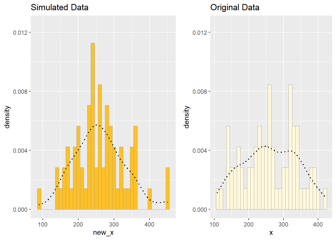
I think the simulated data is alright. It is more peaked than the original data, and also more random spikes, which is not ideal. However, it peaks at about the same place, and has similar spread, which is good.